
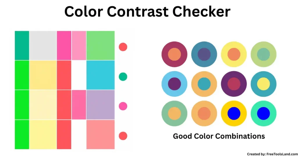
Professional Color Contrast Checker
Test color combinations for to Ensure your designs meet WCAG standards and are accessible.
Foreground Color
Background Color
Contrast Ratio
WCAG Compliance
Normal Text
AA (4.5:1)
Large Text
AA (3:1)
Normal Text
AAA (7:1)
Large Text
AAA (4.5:1)
Text Preview
Color Blindness Simulation
Preview how your color combination appears to people with different types of color vision deficiency.
Normal Vision
Protanopia
Deuteranopia
Tritanopia
Table of Contents
Introduction
In today’s digital world, design is not just about aesthetics, it is about accessibility, readability, and inclusivity. A Color Contrast Checker (also known as a Contrast Checker or Contrast Color Checker) plays a main role in ensuring your website, app, or digital product is visually accessible to all users, including people with visual impairments.
According to the World Health Organization, over 2.2 billion people worldwide live with some form of visual problems. Poor color contrast directly impacts their ability to consume digital content. Ensuring proper contrast is not just good design ,else it is a legal and ethical responsibility under guidelines like WCAG 2.1 (Web Content Accessibility Guidelines).
This article tells more about, what a color contrast checker is, why it matters, how to use it, and how it helps designers, developers, and content creators achieve perfect color accessibility.
What is a Color Contrast Checker?
A Color Contrast Checker is an online tool that compares two colors (typically text and background) and calculates the contrast ratio. The ratio indicates whether the color combination meets accessibility standards like WCAG AA or AAA compliance.
For example:
- White text (#FFFFFF) on a black background (#000000) has a ratio of 21:1 (perfect).
- Light gray text (#CCCCCC) on a white background (#FFFFFF) has a ratio of 1.2:1 (poor).
👉 Try our free Color Contrast Checker tool to instantly test your designs.
Why is Color Contrast Important?
1. Accessibility and Inclusion
- Over 300 million people worldwide are colorblind, according to the Color Blind Awareness Organization.
- Without proper contrast, websites is not really useful for millions of people.
2. Legal Compliance
- WCAG 2.1 guidelines require minimum contrast ratios:
- 4.5:1 for normal text
- 3:1 for large text
- Non-compliance can result in lawsuits under ADA (Americans with Disabilities Act).
3. User Experience & SEO Benefits
- Google rewards accessible sites with better SEO rankings.
- Studies show that 94% of users leave websites with poor design readability.
How Does a Contrast Checker Work?
The process is simple:
- Enter two colors (text and background).
- The tool calculates the contrast ratio.
- Results are compared against WCAG AA/AAA compliance levels.
Example:
- Black text (#000000) on yellow (#FFFF00) = 19.5:1 (AAA Compliant)
- Red text (#FF0000) on blue (#0000FF) = 2.1:1 (Fails WCAG)
Key Features of a Good Color Contrast Checker
- ✅ Easy color input via HEX, RGB, or HSL codes
- ✅ Real-time ratio calculation
- ✅ WCAG compliance checker (AA & AAA)
- ✅ Suggested alternative colors for better accessibility
You can try these tools alongside our Image Text Overlay Tool to see how your text looks in real design environments.
Statistics on Accessibility & Color Contrast
- 86% of marketers believe accessibility improves brand perception (HubSpot, 2024).
- Websites with proper color contrast see 12% higher engagement (Adobe UX Report).
- More than 70% of accessibility lawsuits in 2023 were related to poor color contrast (UsableNet).
These stats make it clear: contrast is not optional but it is important and critical.
Best Practices for Using a Color Contrast Checker
✅ Use High Contrast for Readability
- Aim for ratios above 4.5:1.
- Avoid light text on light backgrounds.
✅ Test Across Devices
- Mobile screens can change color perception.
- Always check both desktop and mobile.
✅ Don’t Rely Solely on Color
- Use icons, labels, and textures to support meaning.
- Example: Instead of red/green only, use ✓✔ and ✖✘ icons.
Comparison Table: WCAG Contrast Ratios
| Text Type | Minimum Ratio | WCAG Level |
|---|---|---|
| Normal Text | 4.5:1 | AA |
| Large Text (18px+) | 3:1 | AA |
| Enhanced Normal | 7:1 | AAA |
| Enhanced Large | 4.5:1 | AAA |
Internal Links for Further Use
- Want to calculate numbers for design budgets? Use our Percentage Calculator.
- Check readability in word count with our Word Counter Tool.
- Adjust images for better design with our Free Image Cropper.
Outbound References (Authoritative)
FAQs
What is the minimum contrast ratio required for accessibility?
For normal text, at least 4.5:1. For large text, 3:1.
Does color contrast affect SEO?
Yes, websites with better accessibility—including color contrast—rank higher in search results.
Can I check multiple color schemes at once?
Yes, advanced tools allow bulk testing of multiple palettes.
Is color contrast required by law?
Yes, in many regions (ADA in the U.S., EN 301 549 in Europe), accessibility laws apply.
Can contrast checkers suggest better colors?
Some tools provide alternative suggestions to meet WCAG standards.