
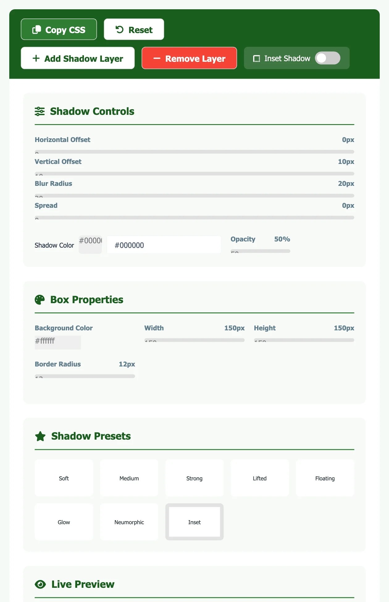
Shadow Controls
Box Properties
Shadow Presets
Live Preview
Generated CSS
Design a CSS box shadow visually and copy the code. Adjust the offset, blur, spread, colour and opacity, stack several shadow layers for a more natural look, start from a preset (Soft, Medium, Strong, Lifted, Floating, Glow, Neumorphic or Inset) and click Copy CSS when the preview looks right.
How to use the box shadow generator
- Pick a preset or start from the default shadow.
- Adjust the shadow controls and the box’s background, size and corner radius until the live preview matches your design. Use Add Shadow Layer to stack a second shadow.
- Click Copy CSS and paste the
box-shadowrule into your stylesheet.
10 ready-to-copy box shadows
These are common, well-tested shadows for cards, buttons and inputs. Each preview uses the exact CSS shown under it.
box-shadow: 0 1px 2px rgba(0, 0, 0, 0.05);box-shadow: 0 4px 6px -1px rgba(0, 0, 0, 0.1), 0 2px 4px -2px rgba(0, 0, 0, 0.1);box-shadow: 0 10px 15px -3px rgba(0, 0, 0, 0.1), 0 4px 6px -4px rgba(0, 0, 0, 0.1);box-shadow: 0 25px 50px -12px rgba(0, 0, 0, 0.25);box-shadow: 0 2px 4px rgba(0, 0, 0, 0.04), 0 8px 16px rgba(0, 0, 0, 0.08), 0 24px 48px rgba(0, 0, 0, 0.08);box-shadow: 0 8px 6px -6px rgba(0, 0, 0, 0.3);box-shadow: inset 0 2px 6px rgba(0, 0, 0, 0.12);box-shadow: 0 0 0 3px rgba(31, 122, 77, 0.35);box-shadow: 8px 8px 16px #d1d9e6, -8px -8px 16px #ffffff;box-shadow: 6px 6px 0 #1d2327;The box-shadow syntax explained
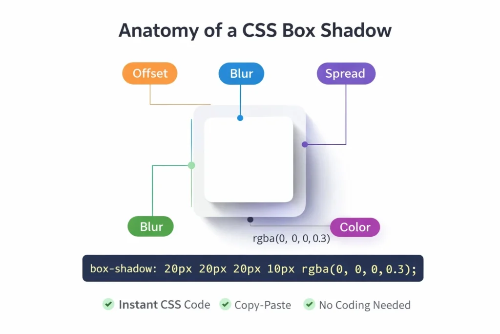
box-shadow: inset? x-offset y-offset blur spread colour;
- x-offset and y-offset: move the shadow right and down (negative values go left and up). A positive y-offset makes light come from above, which looks natural.
- blur: how soft the edge is. 0 gives a hard edge.
- spread: grows (positive) or shrinks (negative) the shadow before blurring. A negative spread with a larger y-offset keeps the shadow under the element, as in “Floating”.
- colour: use a semi-transparent colour such as
rgba(0, 0, 0, 0.1)so the shadow blends with any background. - inset: draws the shadow inside the box, useful for pressed buttons and input fields.
Separate several shadows with commas; the first one is drawn on top. Two layers, one tight and one wide, look more realistic than one big shadow.
Tips for shadows that look good
- Keep opacity low (0.05–0.25). Dark, solid shadows look dated.
- Use the same light direction for every element on the page.
- Bigger, softer shadows mean “higher”: use them for menus and dialogs, small ones for cards.
- Animate
transformoropacityon hover rather than very large shadows on many elements, which can make scrolling less smooth on slow phones. - Do not rely on a shadow alone to show a button or field; give it enough colour contrast too.
Looking for something else? Browse all our free text and developer tools.
Inset, layered and coloured shadows
The same property does three more things that ready-made presets often skip:
- Inset shadows sit inside the element and make it look pressed in, which is useful for input fields and toggles:
box-shadow: inset 0 2px 4px rgba(0,0,0,.15); - Layered shadows combine two or more shadows separated by commas. A tight dark shadow plus a wide soft one looks more natural than one large blur:
0 1px 2px rgba(0,0,0,.2), 0 8px 24px rgba(0,0,0,.12). - Coloured shadows use a darker shade of the background or the brand colour instead of black, which keeps cards from looking grey on coloured pages.
Browser support and performance
box-shadow works without prefixes in every current browser, including Chrome, Safari, Firefox and Edge, according to MDN. The -webkit-box-shadow line that older generators add is no longer needed.
Very large blur values on many elements can slow scrolling on low-end phones, because the browser repaints the shadow. If you animate a shadow on hover, animate the opacity of a pseudo-element that carries the shadow rather than the box-shadow itself.
Frequently asked questions
What is the difference between box-shadow and drop-shadow?
box-shadow follows the element’s box (including rounded corners). filter: drop-shadow() follows the visible shape, so it is better for transparent PNG icons and irregular shapes, but it has no spread or inset.
Does box-shadow change the layout?
No. Shadows are drawn outside the layout and do not take up space, but they can be clipped by a parent with overflow: hidden.
Can I make an inner shadow?
Yes. Choose the Inset preset or add the word inset at the start, as in the “Inner” example above.
Do I still need -webkit-box-shadow?
No. All current browsers support the unprefixed box-shadow property. The prefix only helped very old Safari and Android browsers.
How do I add a shadow on one side only?
Use a negative spread so the blur does not show on the other sides, for example box-shadow: 0 8px 6px -6px rgba(0,0,0,.3) for a shadow only under the element.
Sources
Checked in November 2026:
How to cite this tool
Using this tool for coursework, a report or research? You can cite it like this (APA 7th edition):
Kumar, M. (2026). CSS Box Shadow Generator [Online tool]. FreeToolsLand. https://freetoolsland.com/css-box-shadow-generator/